Dating Pre-Landers: Formats and Mistakes 📝
In dating campaigns there is often one more page between the ad and the offer: the pre-lander. It prepares the user for sign-up, filters out accidental clicks and makes the jump to the offer feel expected. A good pre-lander lifts the sign-up rate; a bad one cuts it and can even get an ad account banned. Below we look at the formats used in dating, what a working page consists of, and how to compare versions against each other.
Why use a pre-lander if the offer already has a landing page
The advertiser’s landing page is the same for every source and GEO. It doesn’t know what the user saw in the ad and can’t adapt to it. A pre-lander closes that gap:
- It continues the promise made in the creative, so the user doesn’t feel a bait-and-switch.
- It engages the user with a couple of simple questions before sign-up.
- It filters out non-target traffic, for example people under 18.
- It gives you room for A/B tests that you can’t run on the advertiser’s page.
You can skip the pre-lander when traffic is already warm, such as search ads on dating queries or push campaigns to subscribers with that interest. For cold traffic from social and native networks, an extra page usually pays off, but this still needs to be confirmed with a test.
Main pre-lander formats
Quiz
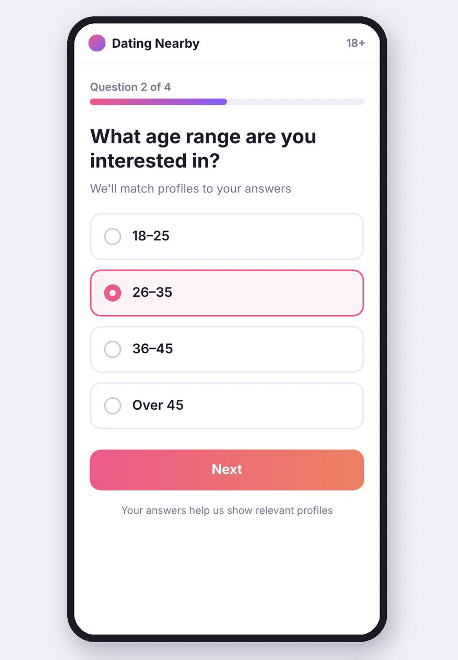
The user answers three to five questions: who they are looking for, the preferred age of a partner, what kind of relationship they want. Often the answers aren’t passed anywhere, but the user has already invested time and arrives at the offer engaged. Quizzes suit mobile traffic, since each answer takes one tap, and the questions are easy to change and test.
Article
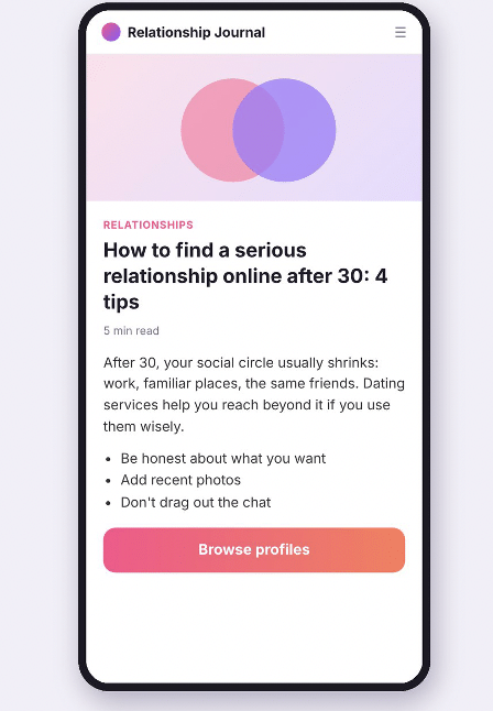
A pre-lander styled as editorial content: dating tips after 30, a couple’s story, or a guide to choosing a dating service. The text leads to a call-to-action button. The format works well on native networks, where the ad looks like a headline, and for older audiences who want more explanation before signing up.
Age confirmation with a short call to action
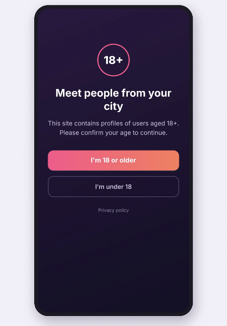
A minimal page with a headline, one or two lines of text and an “I’m 18 or older” button. It is used when the creative has already done most of the work and all that’s left is the age check, without holding the user up. A page like this loads almost instantly, which matters on slow mobile connections.
Format comparison
| Format | Strength | Weakness | Typical use |
| Quiz | Engages users, questions are easy to test | Longer path to the offer | Social traffic, mobile |
| Article | Explains and warms up the user | Needs good copy and localization | Native networks, older audiences |
| Age check and short CTA | Fast loading, minimal drop-off | Barely warms up the user | Warm traffic, push |
What a working page consists of
Whatever the format, a pre-lander that performs shares a common set of elements:
- The first screen continues the creative. If the ad promised dating in your city, the page talks about the same thing instead of offering something new.
- One target action. “Next” or “Continue” buttons, with no menu, external links or other distractions.
- Language and local details. A native speaker translates the copy or at least proofreads it; names, currency and date formats match the country.
- Load speed. Compressed images and minimal scripts. On mobile, every extra second of waiting costs part of your clicks.
- Parameter passing. The click ID and source tags are forwarded to the offer link, otherwise the tracker can’t match the conversion to the click.
- Service links. A privacy policy and a disclaimer if the traffic source requires them.
Mistakes that kill performance or get accounts banned
- Fake messages and notifications. Imitation private messages “from a girl nearby”, fake system pop-ups and unread message counters mislead users and are prohibited by the rules of most ad platforms.
- Promises the product doesn’t keep: “guaranteed date tonight” or “no sign-up needed” when registration is required.
- Explicit images on mainstream offers. This breaks the rules of both the advertiser and the traffic source.
- A path that is too long. A ten-question quiz loses people halfway through.
- No mobile layout. Tiny buttons and text that doesn’t fit the screen.
- One pre-lander for the entire campaign, never compared with an alternative.
How to test pre-landers
Compare pre-landers on the same traffic: the same GEO, source, creative and offer. The tracker splits the flow evenly between versions, and you look at the pre-lander CTR and at what happens after the click through to the offer.
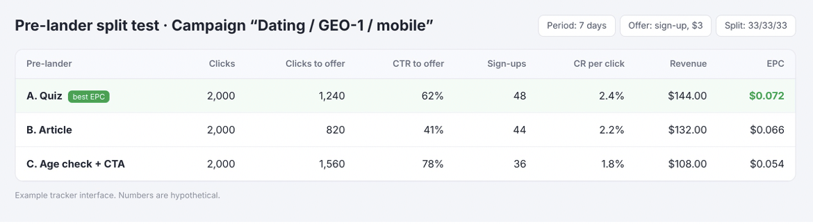
The screenshot shows an example with hypothetical numbers: three pre-landers, 2,000 clicks each, and a $3 payout per sign-up.
The short pre-lander has the highest CTR to the offer but the fewest sign-ups: people click through before they become interested. The quiz sends fewer visitors onward, but they sign up more often, and its EPC is higher. That’s why the decision is based on EPC and ROI, while pre-lander CTR stays a supporting metric.
Metrics worth exporting for each version:
| Metric | What it shows | How to calculate |
| CTR to offer | Share of pre-lander visitors who clicked the button | Clicks to offer / clicks × 100% |
| CR per click | Share of all clicks that ended in a sign-up | Sign-ups / clicks × 100% |
| EPC | Revenue from one click | Revenue / clicks |
| ROI | Whether traffic pays off, including all costs | (Revenue − costs) / costs × 100% |
To make test results reliable:
- Change one thing at a time: the format, the headline or the number of questions.
- Keep the split running until each version has enough conversions, because with a dozen sign-ups the difference can easily be random.
- Check results separately by GEO and device, since the best pre-lander on desktop doesn’t necessarily win on mobile.
Where to send traffic after the pre-lander
The pre-lander prepares the user, but the final conversion depends on the offer they land on. If you are testing several GEOs at once, it’s convenient to put a smartlink behind the pre-lander button: it picks an offer based on the visitor’s country, device and OS. For example, the Datify.Link smartlink uses an AI allocator that distributes traffic across 1,200+ offers in Dating, iGaming, Cams and Games and switches off those that stop converting. Tracker tags are passed in the link the same way as with a direct offer, and a personal manager can suggest offers for your source and GEO.